
The Ordinary


Magazine Layout for The Ordinary
Client: The Ordinary (Student Project)
Project: 20-Page Magazine Layout
Objective: Created as part of a university assignment, this 20-page magazine layout for The Ordinary was designed to explore designers showcasing their works. The project combined custom typography, original imagery, and thoughtful layout design to evoke a sense of quiet observation and aesthetic minimalism.
Challenge
The challenge was to design a visually cohesive magazine that felt both editorial and intimate, balancing clean structure with hand-crafted elements, while showcasing photography in a way that felt personal, nostalgic, and grounded in city life.
Solution
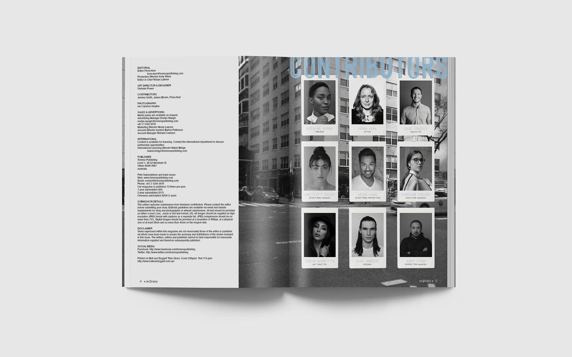
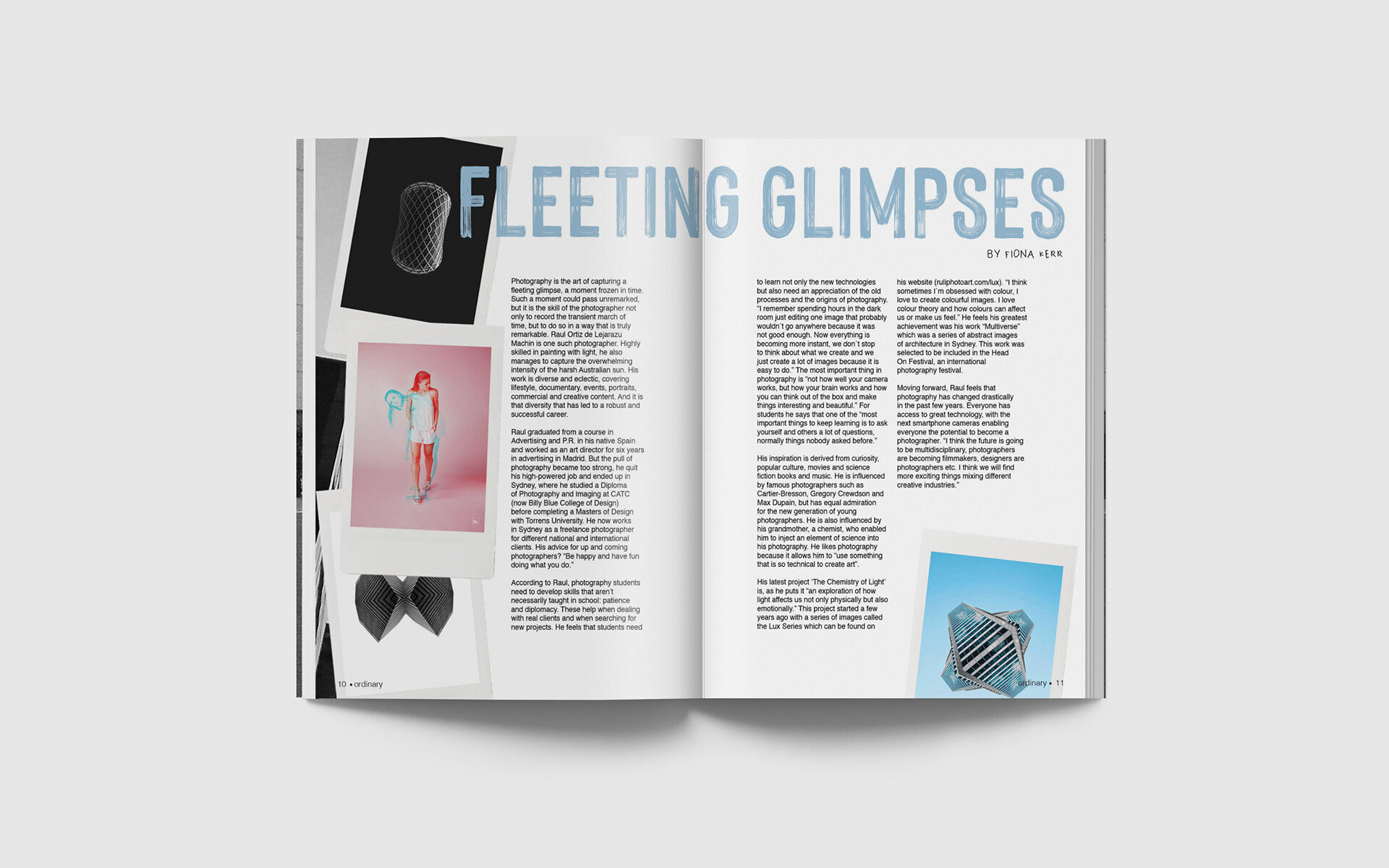
Design Language: A soft colour palette of light blue and white created a sense of calm and clarity throughout the layout, setting a reflective and modern tone.
Imagery: Cityscapes and lifestyle photography were presented through polaroid-style frames to evoke nostalgia and give the imagery a tactile, captured-in-the-moment feel.
Typography: A custom handwritten typeface was paired with clean body text to blend personality with professionalism, mirroring the contrast between structure and spontaneity in urban life.
Editorial Flow: Careful attention was given to pacing and negative space, allowing each spread to breathe while maintaining rhythm across the publication.